Planned Design
When faced with the requirement to create a new website there is a temptation
to use the development tool's WYSIWYG features to prototype the page layouts.
However, the end result of this can often be an ill-structured and difficult to
maintain set of pages. Design by Accident is something to avoid at all costs.
In an organisation with a web development team composed of designers and
developers this process can be avoided as the designer will be a different
person from the developer. However, in many cases the designer and developer are
just two roles for the same person.
In order to avoid design/page creep we should wherever possible produce
the design independent of the development environment using more traditional
artistic tools. This session will look at the key elements and processes
involved in producing a design and translating it into a working, high
quality, usable and maintainable website. We will look at the following
aspects of process:
- Design brief
- Content plan
- Design
- Mark-up and layout specification
- Identifying page structure
- Identifying content structure
Design brief
Working with the client you will have accumulated a range of materials
and information about the proposed website. This will include sample of
artwork, text passages, product information and a rough site map. The design
brief will give an indication of the overall feel of the site and may
discuss issues such as colour patterns and corporate identity.
Content Plan
The content plan is a statement about the content of the pages within the
site. Some pages may contain straightforward text based information, but
others may contain complex repetitively structured data such as product
outlines. The plan should list each proposed page, together with the source
of the information to go in it. This information content may need to be
provided by a third party so the plan will indicate who will provide the
data and the time scales involved. However, the plan will contain details of
the format and structure of the content.
Design
The design brief and content plan can be used by the designer to produce
a visual mock up of the pages within the site. The mock up will be a
pictorial representation of each type of page showing the format and layout
of individual components such as headings, body text, images etc. The design
will set the ground rules for the developer while creating the pages.
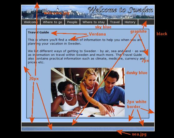
Most designers will produce artwork which includes details of dimensions,
colour references, fonts etc. This information is used by the developer in
the first stage of the development process. The example artwork below shows
a basic design. Some information is omitted for clarity, such as positioning
information, image border details, etc.

For a glimpse of the designer's view of things visit the gallery on
the
EWD website.
Mark up and layout specification
The developer's first task is to translate the designer's notes into a
formal mark up and layout specification. This document forms the base set of
ground rules for all the development effort. Components of the mark up and
layout specification are:
- Mark up versions. e.g. XHTML 1.0 Strict and CSS 2.1
- Font specifications for all text elements (headings, paragraphs etc.)
- Colour specifications in web format (e.g. #0033cc)
- Element borders, margins and padding
- Images, textures etc.
- Positional information
- Specifications for any advanced media content
Identifying page structure
Faced with a complete set of page designs showing the generic layout of
pages the developer will need to identify commonality across the site and if
possible across sets of pages. One would expect that all pages will have a
consistent layout, with the exception of page specific content and the first
task is to isolate the layout and determine a <div> based representation.
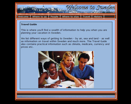
The diagram below shows a first pass at defining this <div> based structure.

This would translate to the following XHTML code in the page template.
<body>
  <div id="content">
    <div id="header">
    ...
    </div> <!-- header -->
    <div id="menu">
    ...
    </div> <!-- menu -->
    <div id="main">
<!-- #BeginEditable "body" -->
<!-- #EndEditable -->
    </div> <!-- main -->
    <div id="footer">
    ...
    </div> <!-- footer -->
  </div> <!-- content -->
</body>
Notice the use of XHTML comments to identify the end of each <div>. These
help with maintenance of the code.
You must take care to identify the correct page structure, represented in
such a way that the design can be easily reproduced in CSS. For example, in
this example the footer appears to have two sections. This may be better
represented with a further subdivision, as follows:
    </div> <!-- main -->
    <div id="footer">
      <div id="topfooter">
      ...
      </div> <!-- topfooter -->
      <div id="bottomfooter">
      ...
      </div> <!-- bottomfooter -->
    </div> <!-- footer -->
  </div> <!-- content -->
This allows the developer more flexibility in re-creating the design
using CSS.
Notice how the page structure is labelled using the id attribute. Since
ids can only be used once on a page this will only work for labelling
one-off elements. Since, we are working with the top level page structure
this is works well. We could have used the class attribute, but by using
id we are identifying the page elements as unique elements within the
page.
Identifying content structure
With the top level structure identified work can start on re-creating the
page layout using a page template and a style sheet. However, planned design
goes beyond just the page structure. A good designer will provide detailed
design notes identifying positional layout and representations for
structured information. For example, the design may specify that all images
float right, have a caption (as well as alternative text) and fixed spacing,
background and border detail. Since images may appear throughout the site,
and maybe several on a page we need to provide a suitable XHTML structure
for this in such a way that the CSS can reproduce the desired visual
representation. The developer needs to go through the content plan and
design and perform a detailed analysis to identify repeating structured
content. This is particularly important if the page design is going to be
used in an active page where the content will be generated from a database.
Some examples of the types of repeated content are:
- Hierarchical text.
<h1>Top</h1>
<div class="level2">
  <h2>Next</h2>
  <p>Some text</p>
</div>
<div class="level2">
  <h2>Next 2</h2>
  <p>Some more text</p>
</div>
- Images.
<div class="floatright">
<img src="images/image.gif" alt=""
     width="100" height="100">
<br/>
Caption here
</div>
- Repeated blocks of structured text. E.g. product details
<div class="productinfo">
  <div class="thumb">
    ...
  </div> <!-- thumb  -->
  <div class="linkdata">
    ...
  </div> <!-- linkdata -->
  <div class="descr">
    ...
  </div> <!-- descr -->
</div> <!-- productinfo  -->
- Menus.
<ul class="nav">
  <li><a class="current" href="index.html">Home page</a></li>
  <li><a href="news.html">News</a></li>
  <li><a href="contact.htm">Contact</a></li>
</ul>
The important point about this process is that by doing the analysis you will
be making sure that your pages are constructed in a consistent and well
engineered way.