Simple CSS based flexible button menus
Introduction
Graphical menus seem to be the norm nowadays and there are lots of sites pushing
a wide variety of techniques. This mini-tutorial attempts to put together some simple
guidelines for creating flexible effective graphical menus. The first section will
deal with text based menus with a background graphic and the final section will
deal with the issues in using graphical buttons with image replacement.
Text menus with a background graphic
The simplest place to start is with a vertical menu and we will build from there.
You can view a page with just the four example menus. We will use the same underlying code for all menus - that of the unnumbered list
(<ul>), but it will be placed in a <div> to isolate the CSS:
<div id="menu">
  <ul>
    <li><a href="#">Hello</a></li>
    <li><a href="#">Goodbye</a></li>
    <li><a href="#">Tara</a></li>
    <li><a href="#">Hi</a></li>
  </ul>
</div>
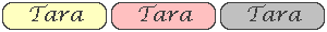
The button images
Prepare a single image with three buttons in it, one for the unselected state, one
with the hover state and one for the current page - the CSS will move the appropriate
button behind the link. The button needs to have enough space in it for the text
which will be overlayed onto the button for each menu item.
e.g.

Step 1 - remove the inherent styling in the list
#menu, #menu li, #menu ul {
  margin: 0;
  padding: 0;
}
#menu li {
  list-style-type: none;
}
Step 2 - set the size of the list item
Since our buttons will have a background graphic we need each list item to be of
an appropriate size. Our image has three 100px by 30px buttons in it.
#menu li {
  list-style-type: none;
  width: 100px;
  height: 30px;
}
Step 3 - Format the anchor and place the button image behind it
In the simplest of cases we can make the anchor fill the list item and position
the text dead-centre. Our image has a little bit of space around it so we won't
need any padding. The main problem is that the <a> element is by nature an
inline element and cannot be sized, so we must convert it to a block element before
anything else. Also to centre the anchor text we set the text alignment and the
line-height.
#menu li a {
  display: block;
  line-height: 30px;
  text-align: center;
  width: 100%;
  height: 100%;
  background-image: url('button.gif');
}
Since the anchor has a size exactly equal to the basic button size in the background
image we just see the first button.
Step 4 - Adding the hover effect
This is simply achieved by changing the background position by moving it so the
hover effect button is underneath (in this case 200px to the right - or -100px to
the left, you can choose)
#menu li a:hover {
  background-position: 200px 0;
}
The end result
Making a horizontal menu
The only difference from the vertical menu is to float the list-items to the
left. We can't change the list items to inline display as we want to make sure
they have the correct size:
#menu li {
  float: left;
  list-style-type: none;
  width: 100px;
  height: 30px;
}
which results in:
Spacing and positioning the menu
By specifying the size and positioning of the container <div> and the <ul>
element we can control the layout of the menu. The simplest way to spread out
the links is to make the list items bigger and use margin settings to position
the anchors inside them:
Step 1 - Increase the size of the list items
#menu li {
  float: left;
  list-style-type: none;
  width: 150px;
  height: 50px;
}
Step 2 - Position the anchors in the middle of the list items
Note: you can't increase the size of the anchors as the button background won't
display correctly, though it would work if you used individual images for the
three button effects and set the background-repeat to no-repeat:
#menu li a {
  display: block;
  line-height: 30px;
  text-align: center;
  width: 100px;
  height: 30px;
  background-image: url('button.gif');
  margin: 10px auto;
}
which results in:
Setting the current page button properties
You often would like the link button for the current page to be disabled or at
least display differently to let the use know their current location. This is
easy to achieve if you hand craft the menu on each page, but if you want to use
a template based menu to help manage your code efficiently you need an
alternative approach. The trick is to give each menu item a unique id which can
then be targetted by a small bit of CSS inside each page.
Step 1 - Modify the menu to provide unique ids for each item
<div id="menu">
  <ul>
    <li><a id="hello" href="#">Hello</a></li>
    <li><a id="goodbye" href="#">Goodbye</a></li>
    <li><a id="tara" href="#">Tara</a></li>
    <li><a id="hi" href="#">Hi</a></li>
  </ul>
</div>
Step 2 - Insert the CSS to target the current pages button
This needs to be repeated for each page, using basically the same CSS, but
targeting the appropriate link. The code goes in the <head> content section of
the page:
<style type="text/css">
  a#hello, #menu li a#hello:hover {
    background-position: 100px 0;
    cursor: default;
  }
</style>
Note how we not only move the selected page button background into view, but we
change the cursor to the default to hide the fact that the button is still a
link
Resulting in:
Menus with individual graphical buttons
Quite often the web designer will have a design concept which
makes it difficult to use XHTML text overlaid on a background button image. In
such cases the only alternative is to have separate button images for each menu
item. For example:


It is acceptable, and indeed usual, to have links attached
to images on a web page, but only where the image is informative, for example
where it is a thumbnail linked to a full-size version of the image.
We could use the same technique in our menu, e.g.:
<li><a href="contact.html"><img src="contactbutton.gif"
                                alt="Contact"></a></li>
There are several problems with this approach. From a technical standpoint it is
difficult, if not impossible, to provide context sensitive button images (e.g.
Hover effect) without resorting to the use of JavaScript. However, from a
usability/accessibility standpoint, the XHTML structure does not map logically
onto the content/semantic structure - we really only have a list item with a link in
it, but the XHTML adds the extra image element which has no semantic association
with the actual page content. The only real alternative is to make use of CSS
image replacement techniques to provide decorative buttons in place of the
anchor text.
Simple Image replacement techniques
There are a whole raft of image replacement techniques, but very few stand up to
close scrutiny.
One popular technique wraps the text to be replaced in a <span> element. CSS is
used to place background image on the surrounding object (e.g an anchor), and
some technique is used to 'hide' the text in the <span>.
For example:
<li><a class="contact"
       href="contact.html"><span>Contact</span></a></li>
with CSS either like this:
.contact a {
  other: css;
  background-image: url('contactbutton.gif');
}
#menu a span {
  display: none;
}
which suffers from accessibility problems as a screen reader will not have
access to the text for the anchor - or like this:
.contact a {
  other: css;
  background-image: url('contactbutton.gif');
}
#menu a span {
  position: absolute;
  left: -9999px;
}
which is fine for screen readers, but if images are disabled the text is not
visible as it is off screen. You may argue that not many people will turn images
off, but leave CSS on, but this is a very flimsy argument.
A better technique
A better technique is to use the z-index attribute to place the button image
over the top of the text, however, the CSS for this is slightly more complex,
and requires the use of an empty <span> element as a target for the button
image. Purists may argue that having an empty span makes the code untidy, but a
<span> element is non-semantic and its use in this case is limited to a specific
site wide use - probably in the site template.
Our list item now looks like this:
<li><a class="contact"
       href="contact.html">Contact<span></span></a></li>
The CSS for the anchor now looks like this:
#menu li a {
  display: block;
  position: relative;
  overflow: hidden;
  width: 100%;
  height: 100%;
}
Note: there is no backgroung-image specified on the anchor and instead we
position the anchor relative to it's container (i.e. the list item). The hidden
overflow attribute makes sure that if the actual text in the anchor is bigger
than the button it will not upset the display.
We now need the CSS for the span:
#menu2 li a span {
  display: block;
  position: absolute;
  left: 0;
  top: 0;
  z-index: 1;
  width: 100%;
  height: 100%;
}
The span is positioned directly above (using z-index) the anchor and exactly the
same size. This will apply for all our list items. An addition CSS rule can be
used for each anchor to apply individual button images, e.g.:
.contact span {
  background-image: url('contactbutton.gif');
}
And another rule can handle the hover effect (for all items) by changing the
background-position of the image:
#menu li a:hover span {
  background-position: 200px 0;
}
This technique works for all combinations of CSS on or off and images on or off.
View an example page showing the better technique applied
to all the top scenarios.